
How to Get Insights in the Process Industry: Mastering Data Visualisation
Explore “what good looks like” in the process industry for strategic decision-making, focusing on data visualisation.
Updated 11 March 2025 6 min read
This article explores the vital concept of understanding “what good looks like” in the process industry for strategic decision-making, focusing on data visualisation.
Everyone on the plant team needs to know what’s happening, what should happen, and the next steps if things go off track. Managers often make the mistake of assuming their team knows these expectations. In this industry, quick, well-informed decisions are critical. This skill hinges on identifying “what good looks like,” which means moving past gut feelings to rely on solid data visualisation techniques for every worker in the organisation. And I said solid, not complicated.
The Simplicity of Visual References
To kick things off, let’s consider the simple yet effective analogy of thermometers used to measure body temperature. What is the difference between the two images below?
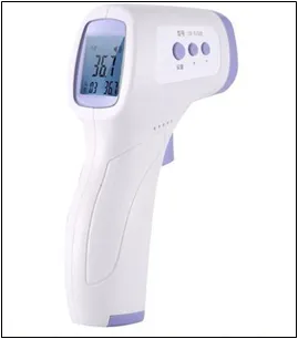 Image 1: A body thermometer
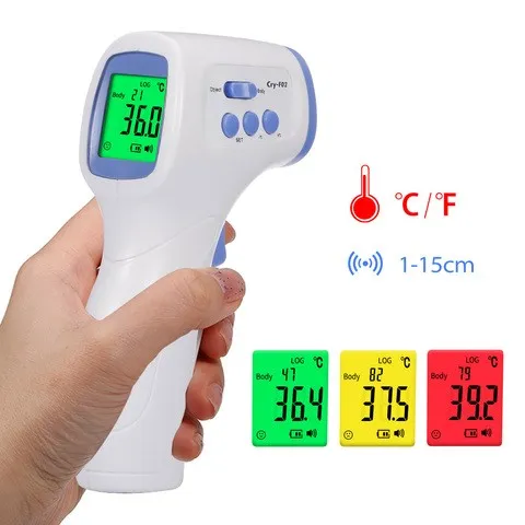 Image 2: Another body thermometer with colours.
The thermometer on the left, without any reference values or colours, provides a number that lacks context or immediacy in decision-making. Contrast this with a thermometer on the right, with a colour-coded scale — green for normal, yellow for caution, and red for fever. This design doesn’t just communicate data; it contextualises it, making the decision-making process immediate and intuitive.
And when it comes to data, context can change everything.
“For me, context is the key – from that comes the understanding of everything”
American Painter, Kennet Noland
Application in the Process Industry
Clear and context-specific data visualisation in the process industry is crucial due to its significant impact on safety, efficiency, and sustainability. It enables rapid and informed decisions by presenting essential data such as progress toward goals or deviations from standards, steering efforts toward achieving the desired outcomes. This synergy significantly improves operational excellence and quality and fosters continuous improvement.
Examples of What “Good” Looks Like
Data visualisation tools are transformative, converting raw data into practical insights through process graphics and dashboards. These tools use explicit references and colour coding to highlight performance relative to targets or safety limits, demonstrating considerable effects across the industry. Some interesting impact examples on the sector are:
Enhance Operational Safety: Safety Gauges
For operational personnel, a gauge that uses colour references to indicate safety, warning, and critical levels can instantly communicate whether a process operates within safe parameters or if intervention is needed. It is important to note that references are not only necessary in the field. The control system should display all process information to facilitate understanding so control room operators can make quick and safe decisions.
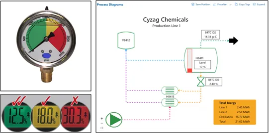 Image 3: Gauge (left) Process diagram in the Cyzag platform, showing information quickly (right)
Drive Decisions to Improve Efficiency: OEE Tools
For both shopfloor workers and management, dashboards that visually categorise data points according to their strategic importance — using colours, shapes, or sizes — can highlight areas of opportunity or concern that require attention.
Combining this data with contextualised information for control room operators can help them identify deviations and drill down to specific causes, solving the issues as soon as they happen and avoiding extra costs.
The images presented below serve as an example, illustrating that Overall Equipment Effectiveness (OEE) marked as amber is signalling it requires attention. A detailed breakdown of OEE-related information is provided to assist operators in making informed decisions. This breakdown is organised with colour coding, highlighting other amber areas that need focus while distinguishing them from those marked green.
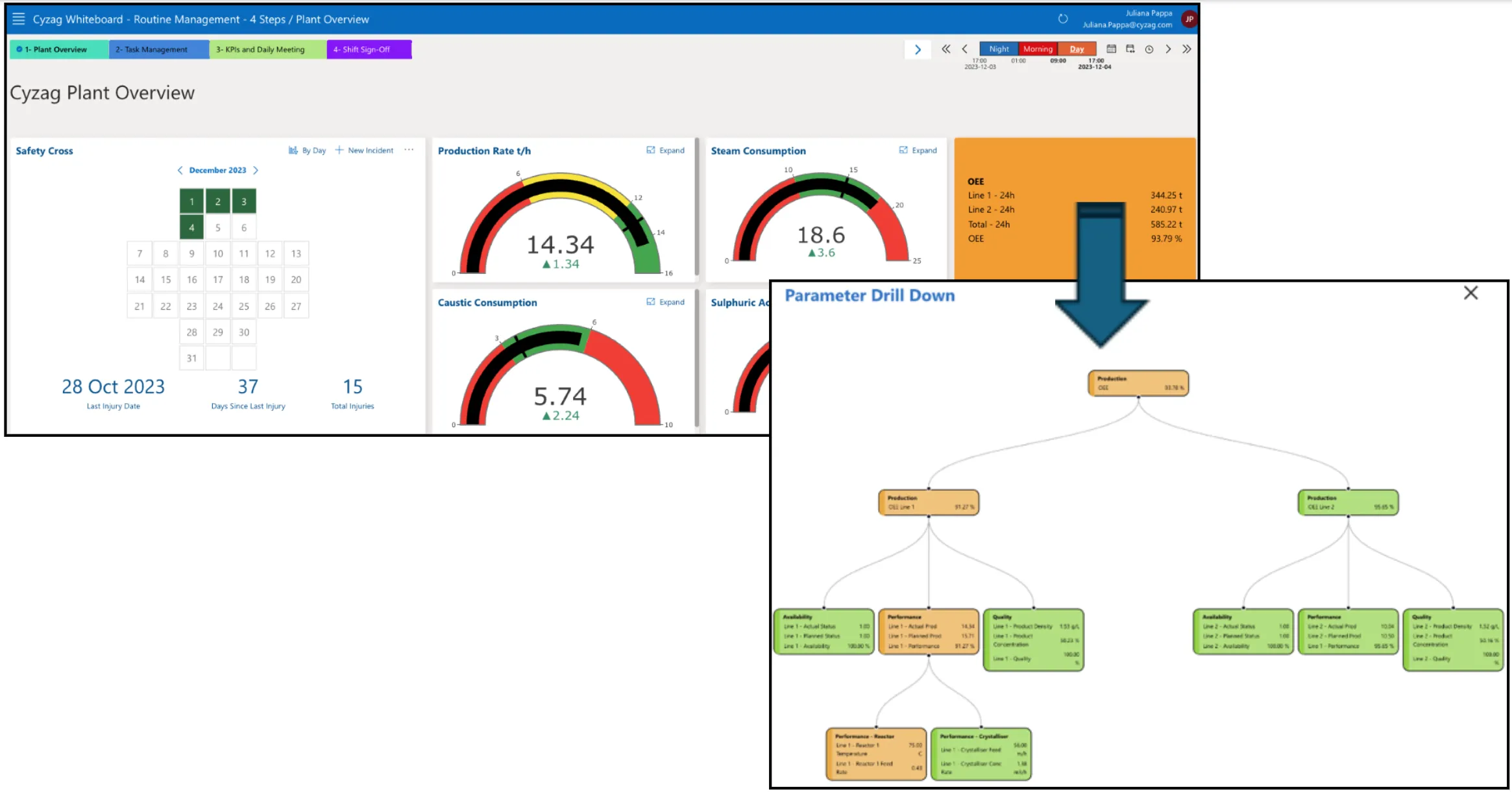 *Image 4: A typical Cyzag Plant Overview board with custom widgets. The arrow points from the OEE to a parameter drill down, illustrating colour coding being used. *
Foster a Culture of Transparency and Innovation: Data Visualisation
Making data visible and accessible encourages workers to share issues rather than conceal them. This approach is rooted in the idea that visibility into all aspects of operations enhances safety and efficiency. By employing data visualisation tools that not only highlight areas of concern but also facilitate easy reporting and sharing of potential problems, organisations can create an environment where issues are promptly addressed and innovation is welcome. This proactive stance on problem-solving prevents minor issues from escalating and contributes to a culture of transparency and continuous improvement.
Facilitate Industry Benchmarking: What “Good” Looks Like
By establishing clear visual standards for “good” performance, companies can more easily benchmark their operations against other plants, industry standards or competitors, identifying areas for improvement or innovation.
The Path to “Good”
Establishing the path to “good” in the context of data visualisation within the process industry involves five key steps. These actions are crucial for demonstrating what “good” looks like because they collectively ensure that data visualisations are effective, user-friendly, and aligned with organisational objectives:
1. Define Clear Objectives
Understand what decisions the data visualisation tool needs to support. Are they related to KPIs or used more broadly, such as for process control? This will guide the design principles and ensure the visualisation serves its intended purpose.
2. Employ User-Centric Design
Design visualisations with the end user in mind. What information do they need, and how can it be presented most effectively? Will we use paper or adopt a digital platform? This may involve user testing and feedback loops to refine the tool.
3. Use Visual Cues Wisely
Colour coding, shapes, and other visual cues can guide the user’s attention to the most critical information. However, to make visual management efficient, using these cues consistently and in a way that aligns with universal or culturally specific colour associations is crucial.
4. Provide Contextual Data
Just as the thermometer with a colour-coded scale offers immediate context for its readings, ensure that your visualisations provide the necessary background information or comparative data to make the information meaningful.
5. Iterate and Evolve
The definition of “good” may change as business objectives evolve or new data becomes available. Regularly review and update visualisations to ensure they remain relevant.
Having data, creating context, and establishing what good looks like is crucial. But so are the people who will use them for decision-making. So, develop routines to discuss it, perform root cause analysis for critical items, and encourage the mindset that deviations from “good” are not problems but opportunities to improve.
Conclusion
In the process industry, knowing what good looks like and visualising it is essential for strategic decision-making. By learning from simple, effective designs like the colour-coded thermometer and applying these principles to more complex data visualisations, we can enhance our ability to make informed, strategic decisions that drive success. Using a digital platform can make this process simpler and more effective.
This foundational approach to visualising data aids in operational and strategic decision-making. It also creates an environment of clarity and transparency. This is vital for delivering efficiency and making the process industry sustainable.
Follow Cyzag on LinkedIn for new articles and stories.